
Despite my absolute lack of understanding about municipal finances, I did the Strong Towns Finance Decoder Worksheet for DeKalb County, GA. We’re in the unincorporated county, so this is my most local government. I’m not sure if there’s a meaningful difference with a county like DeKalb and an incorporated municipality.
The documents were easy to find on the county’s Financial Reports page. Govt assets and Bus assets were the most unclear rows in the sheet. I used the sum of Land and Construction in Progress costs for the not depreciated values, and then subtracted that from the Totals to get the being depreciated values. I didn’t see anything obvious for other assets so left those rows blank.
I didn’t see deferred inflows reported prior to 2015 nor deferred outflows prior to 2011, so those values are blank for years not reported. I don’t know how that affects the results.
My Google sheet is here. Please make a copy and fix any mistakes I made.
Results
Sustainability Indicators
Net Financial Position
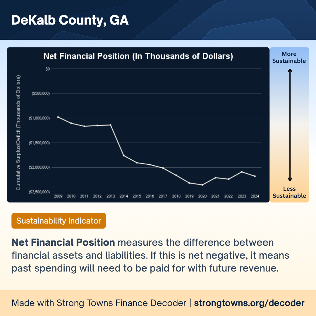
Net Financial Position measures the difference between financial assets and liabilities. If this is net negative, it means past spending will need to be paid for with future revenue.
Notable here is that a negative value indicates the county “has spent more than it has saved and is relying on future revenue to pay past bills.” I don’t know what to make of the big drop around 2014 and subsequent decline to 2018/2019, but 2014 is when deferred inflows got their own line in the reports.
Financial Assets-to-Total Liabilities
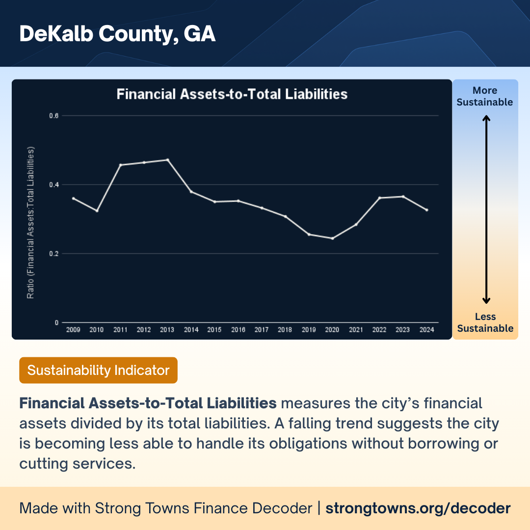
Financial Assets-to-Total Liabilities measures the city’s financial assets divided by its total liabilities. A falling trend suggests the city is becoming less able to handle its obligations without borrowing or cutting services.
Notable here is that a “ratio below 1 means [the city] would not be able to pay off its liabilities using only its financial assets, which is a sign of financial stress.”
Total Assets-to-Total Liabilities

Total Assets-to-Total Liabilities measures the value of all the city’s assets (including infrastructure) divided by its total liabilities. A downward trend means the city is becoming less solvent.
Some good news: a “ratio above 1 means the city owns more than it owes (solvent).” So DeKalb seems to have enough capital assets to be solvent.
Net Debt-to-Total Revenues
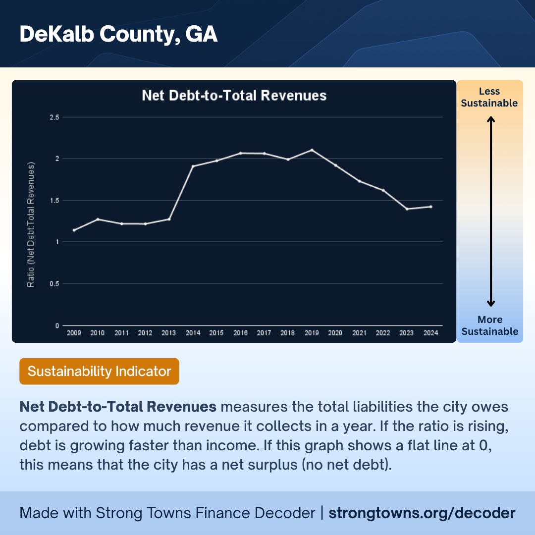
Net Debt-to-Total Revenues measures the total liabilities the city owes compared to how much revenue it collects in a year. If the ratio is rising, debt is growing faster than income. If this graph shows a flat line at 0, this means that the city has a net surplus (no net debt).
Looks like we had a rough patch from 2014 to 2019 of increasing debt-to-revenue.
Flexibility Indicators
Interest-to-Total Revenues

Interest-to-Total Revenues measures the percentage of annual revenue spent on interest payments. An increasing trend limits future choices and can crowd out basic services.
This one’s an encouraging story. Looks like we’ve improved our flexibility and budget health.
Net Book Value-to-Cost of Tangible Capital Assets
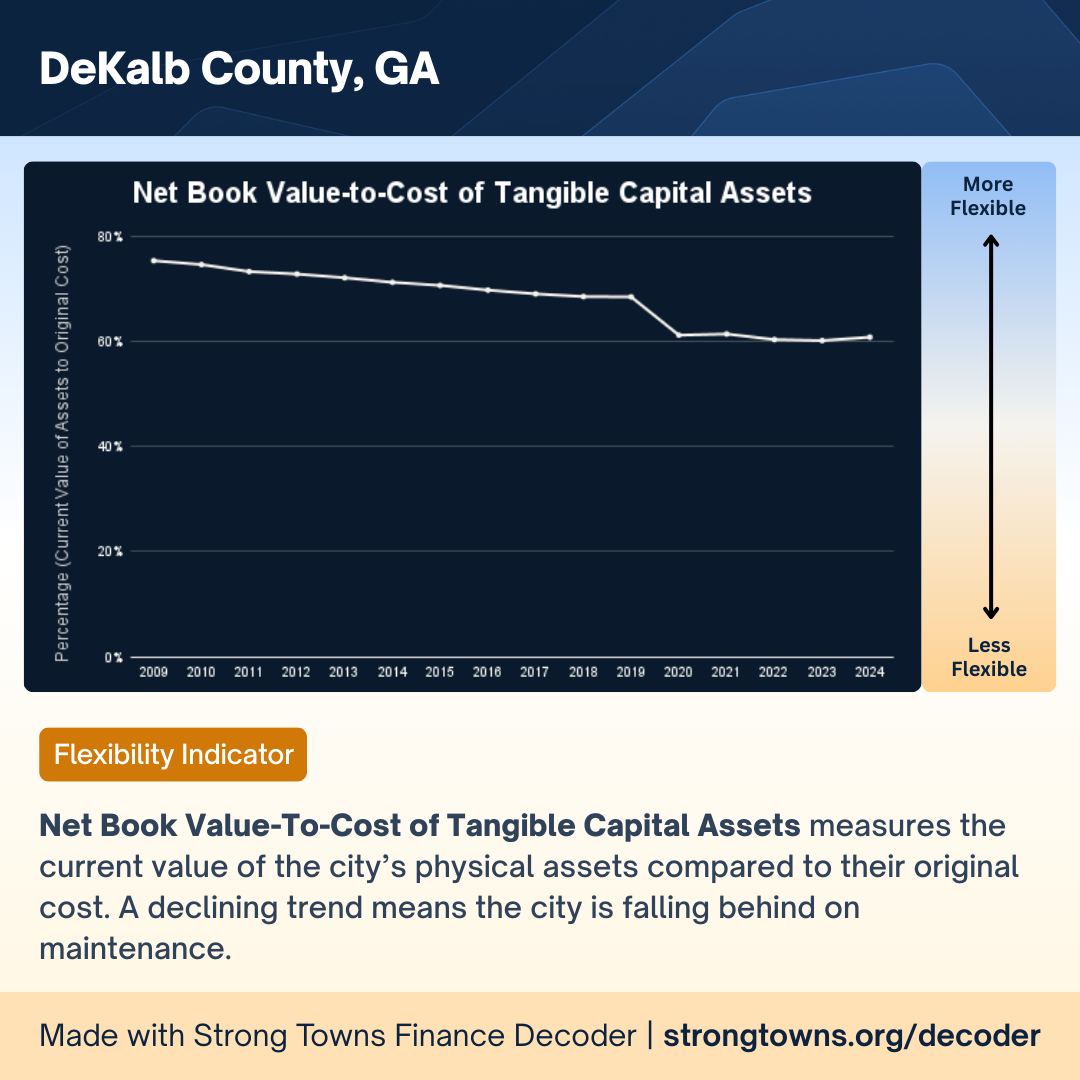
Net Book Value-To-Cost of Tangible Capital Assets measures the current value of the city’s physical assets compared to their original cost. A declining trend means the city is falling behind on maintenance.
I’m not sure what happened between 2019 and 2020, but seems like we’re holding steady on maintenance.
Vulnerability Indicators
Government Transfers-to-Total Revenue
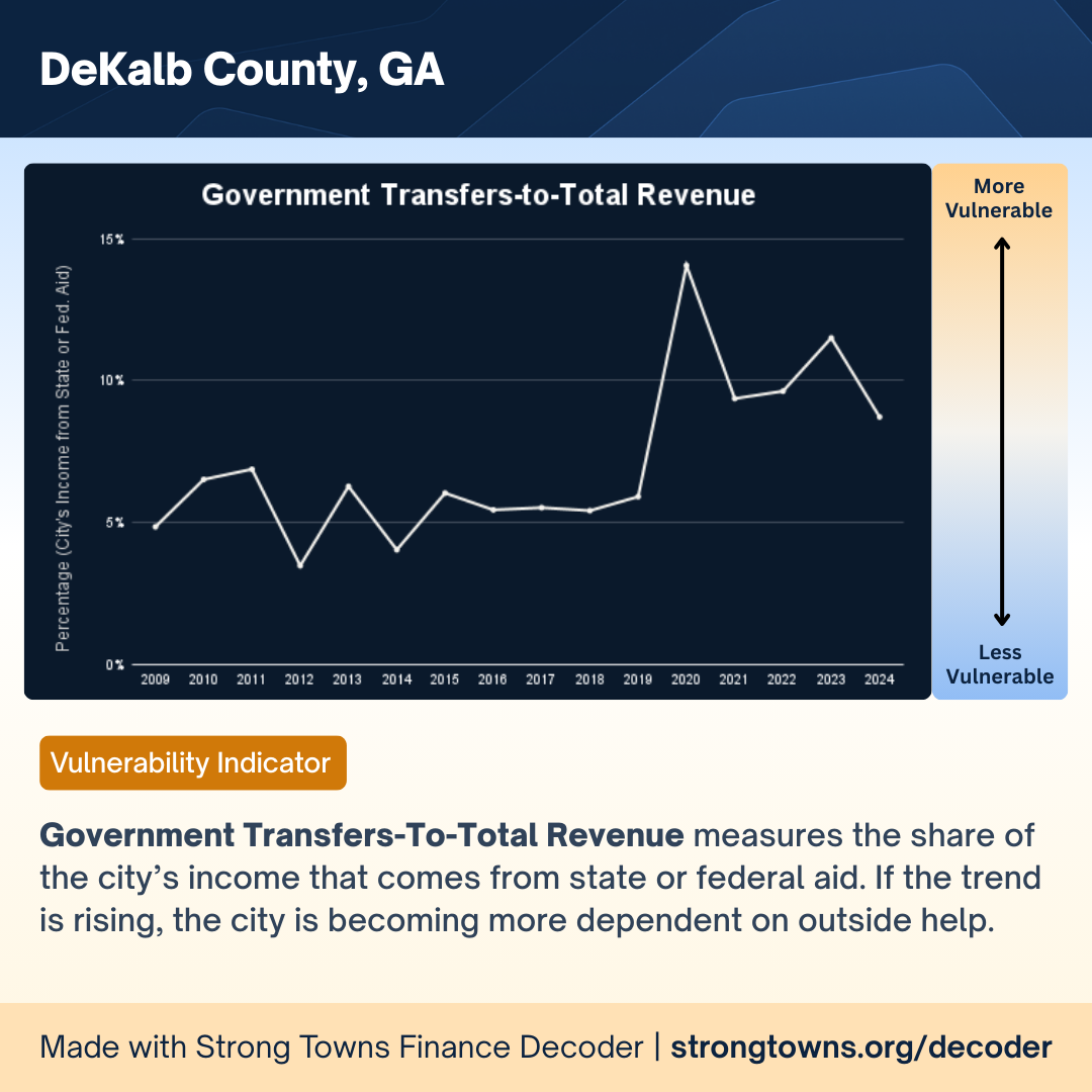
Government Transfers-To-Total Revenue measures the share of the city’s income that comes from state or federal aid. If the trend is rising, the city is becoming more dependent on outside help.
This feels important in today’s political climate of unreliable federal funding. I imagine the 2020 spike is from covid 19 federal support.
Parting thoughts
I don’t know enough to know how to interpret the whole of this data. Seems like the county is doing okay from a total assets/liabilities standpoint, but not from a financial assets/liabilities.
I’m surprised by the Net Book Value-To-Cost of Tangible Capital Assets given our water infrastructure crisis.
The decrease in Interest-to-Total Revenues looks good. I wonder what a “good” value for Government Transfers-to-Total Revenue is.